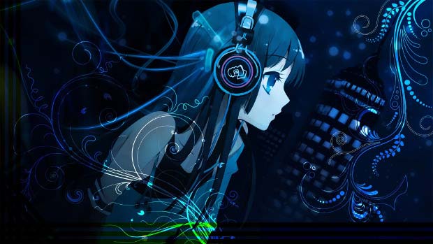
Some people say “Do not judge the book by its cover” but it is hard to deny that it is a cover that we see before perceiving the content behind it. A good cover of a book, anime movie or cartoon helps to attract broader attention to your work. A good cover can be a self-sufficient piece of art. Finally, a good cover can motivate people to continue watching or not.
One of the most interesting cover formats is the square one. It has its own history that goes back to vinyl records, musical CD albums, and polaroid pictures. Today the format is actively used in iTunes podcasts, Instagram and Clilk animations, not mentioning specific books, posters, postcards, and many other things. Frankly, there is nothing very special in square canvas comparing to other canvases. However, sometimes it is difficult to get used to this particular format, and you need to get in the right mindset to create a proper design.
In this article, we gathered the most important design tools and strategies that will help you to make up your mind to create a beautiful and catchy square cover for your animated story.
1. Focus
When you create a square movie cover the first question you should ask yourself is what the movie is about. What is the central idea of the animation? What your audience should know about it before watching? Once you have answered the questions, you can put this concept in the center of the cover.
The central object could be a title of the movie, a character or a key element of the narrative that pushes the whole story forward. It is always hard to choose one object as many things may seem important but the focus strategy implies that you need to be brave and make this decision.
In order to put the chosen element in the focus of your cover, you should give a priority to it: bigger size, more contrast, more weight, central position but it would be even better if you use all these ways of highlighting together.
2. Balance of elements
An essential strategy of any design is harmonization of composition. All the elements: text, objects, background, and ornaments have visual weight. The weight of elements inevitably comes from color, texture, and size. Basically, the darker and bigger object the heavier it is. Thus, balance is an equilibrium of objects on the canvas.
Depending on the balance of objects you can create a symmetrical or asymmetrical composition. In order to experiment with balance, you need to divide the square canvas into two random parts and put equal or different weight on both of them. The idea of balance gives a vast space for playing with elements’ positioning.
3. Contrast
Contrast is a tool that helps you to highlight what is really important in the whole composition. This design strategy gives a very strong visual effect, so be sure that the shouting cover corresponds to the mood of your movie.
In order to apply contrast, you need to make the object or text radically different from the background. Contrast basically deals with the juxtaposition of colors, so black and white are traditionally the most contrasting once. However, do not forget that shapes and sizes could also be contrasting.
Mentioned in this article
-
Rick and Morty characters images
$0.00 -
Harry Potter Original Characters
$0.00 -
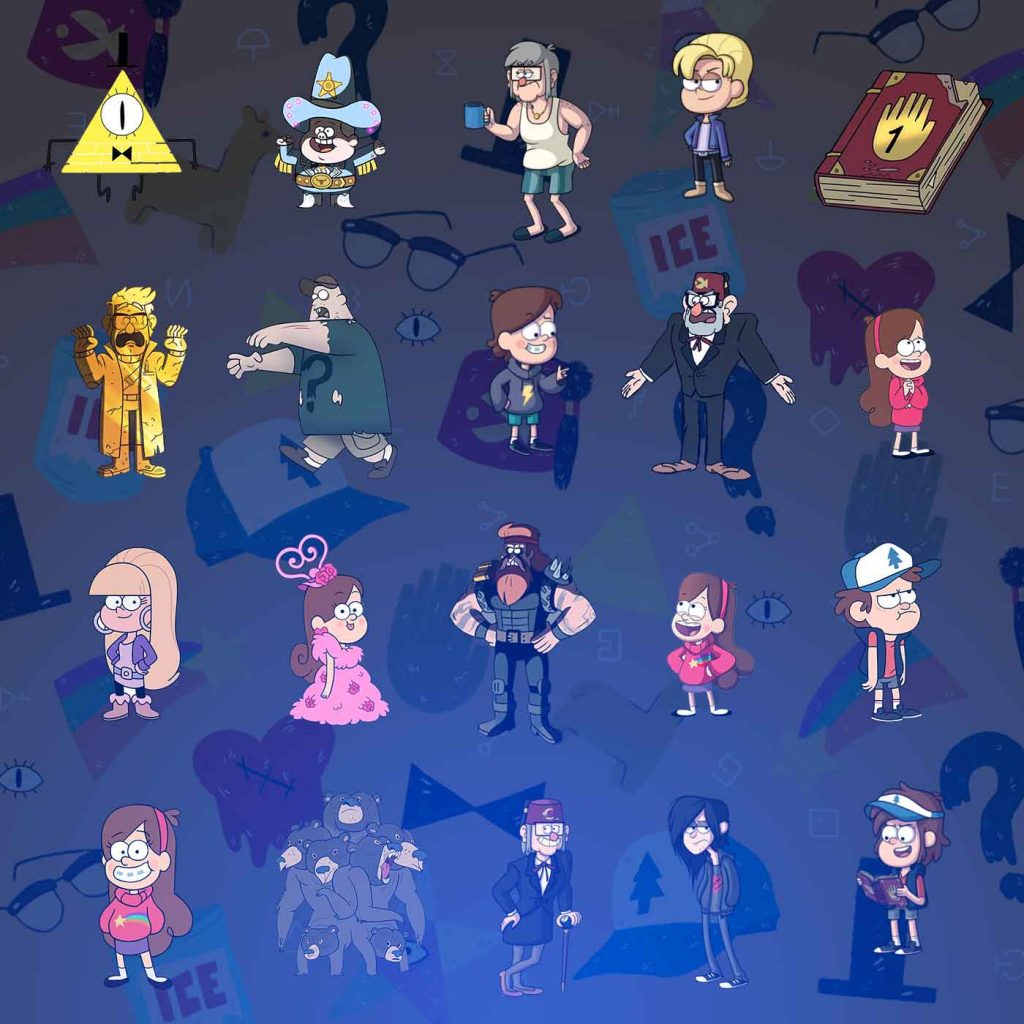
Gravity Falls All Characters and Backgrounds
Original price was: $15.00.$10.00Current price is: $10.00.


4. Rhythm
The rhythm of composition comes from the repetition of its elements. Rhythm helps you to organize and harmonize the composition.
By repeating colors, fonts or shapes you create a specific motif on your cover. It would be even better if the repeated element contains a significant meaning to the whole animation. The repetition of an element does not mean replication of it, you can modify the shape of the element but leave it fundamentally the same.
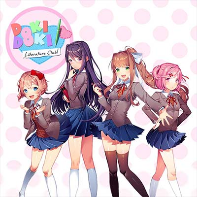
For instance, look at the skirts of the characters of Doki Doki Literature Club on the cover above. Those skirts become the central element that is repeated in the picture, apart from legs, jackets, girls themselves and pink circles in the background. Anyway, the skirts refer to school life and girls in general as the key characters of the game.
5. Proportion
The proportion in design is a combination of elements in comparative relation to each other. Applying proportion is especially reasonable when you decide to put several objects or phrases on a cover, so you can organize them in some hierarchy according to its weight and size.
6. Dynamics
Dynamics of composition is the organization of elements that leed viewer’s eyes from one point to another. Dynamics is usually characterised by a disbalanced and asymmetrical organization that has a triangle geometry in its foundations.
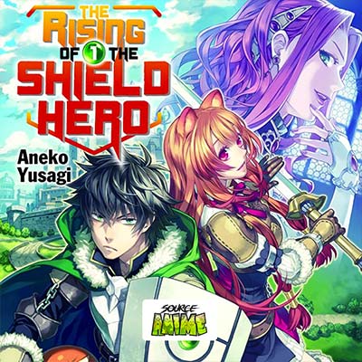
In order to make a dynamical composition, you can divide a canvas with straight lines and move them trying to direct the whole composition to one point. This design strategy would especially suite to action movies like The Rising of the Shield Hero.
7. Negative Space
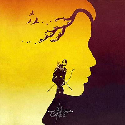
Negative Space could be also called a counterform and means the blank space between or around objects that turns into a separate form or object. This design is especially effective because it refers to viewer’s powers of observation and delivers an aesthetic and intellectual delight. It is probably one of the most difficult design strategies but if you manage to master the negative space, be sure your movie will attract people’s attention.
Find out how to set a cover of your animated movie in CLILK in the short tutorial, pay attention to Step. 11.